


When presenting asset investment plans to a board, the key is to simplify complex data and connect it to the organization’s priorities. Board members care about financial returns, risk management, and long-term outcomes – not technical jargon. Here’s how to get their attention:
- Tell a Story with Data: Use numbers to show clear outcomes. For example, explain how a 10% budget increase could reduce long-term costs by 22%.
- Focus on Board Priorities: Highlight financial returns (e.g., ROI), risk reduction (e.g., failure risks), and measurable outcomes like sustainability goals.
- Tailor the Message: Speak to individual concerns – cash flow for the CFO, risk for audit chairs, and operational impacts for others.
- Structure the Presentation: Start with a one-page summary (problem, solution, benefits), followed by detailed context and scenario comparisons.
- Use Effective Visuals: Charts, heat maps, and dashboards simplify data and speed up decision-making.
- Be Transparent: Clearly outline trade-offs, risks, and contingencies to build trust.
A well-prepared, clear presentation ties the numbers to actionable insights, helping boards make informed decisions faster.
Aligning Your Presentation with Board Priorities
What Boards Care About Most
Board members focus on three core areas: financial returns, risk management, and sustainability. To align with these priorities, you need to go beyond surface-level insights from annual reports and dig deeper into the governance documents that guide their decisions.
Start by reviewing board charters, governance guidelines, and proxy statements to identify what truly matters to the board [5]. For instance, if the audit committee charter explicitly includes oversight of climate-related financial disclosures, it’s clear that sustainability is more than just a buzzword – it’s a formal obligation. Similarly, examining director profiles through board matrices and biographies can reveal individual areas of expertise, such as financial risk, operational resilience, or ESG compliance [5].
Pay attention to shareholder proposals that receive 20%-50% support, as they highlight issues that demand attention [5]. For example, in 2025, AI-driven capital planning often requires continuous infrastructure investment rather than one-time upgrades [6]. Additionally, many boards now require an AI Risk & Impact Assessment (ARIA) before approving capital for high-risk systems [6].
Boards also expect more than just traditional metrics like net present value (NPV). As Chris Griggs of McKinsey & Company explains:
Net present value is the bedrock of ROI estimates, but adding other factors to the analyses can help business leaders see how projects can advance corporate priorities beyond financial returns [3].
This means supplementing NPV with metrics such as dollars per ton of CO₂ abatement, impacts on supplier lead times, or improvements in service uptime. The goal is to demonstrate how a project with strong NPV might also reduce regulatory risks or enhance operational resilience – or how a project with moderate financial returns could deliver significant sustainability benefits.
Adapting Your Message for Different Stakeholders
Once you understand the board’s priorities, the next step is tailoring your presentation to address the specific concerns of individual members. For example, the CFO will want detailed insights into cash flow timing and the costs of delaying a project. The audit committee chair will focus on how risks – like climate or technology-related issues – affect asset impairments and financial statement accuracy [5]. Meanwhile, a board member with an operations background will prioritize the impacts on service reliability and predictability.
Before the board meeting, collaborate with key committees – such as Finance, IT, Legal, and ESG – to ensure that risk and value perspectives are aligned [6]. This is especially important for complex initiatives like AI infrastructure or energy transition projects, where technical, financial, and regulatory factors all come into play.
To help board members evaluate diverse priorities, use a normalized scoring system. This approach simplifies comparisons across projects [3]. For instance, when presenting initiatives ranging from cybersecurity upgrades to carbon reduction efforts, normalize metrics into a single score, such as "advantage per dollar." This lets the board see, at a glance, how a high-return project might conflict with sustainability goals or how a modest investment in resilience could prevent costly future issues.
Be upfront about trade-offs. For example, explain how a 10% budget increase could reduce total cost of ownership by 22%, or how a 10% budget cut might add $4.3 million in expenses over five years [1]. Transparency about these trade-offs helps board members make well-informed decisions.
Presenting to the Board 101 and How to Read Financial Statements for Boards and Directors
How to Structure Your Presentation
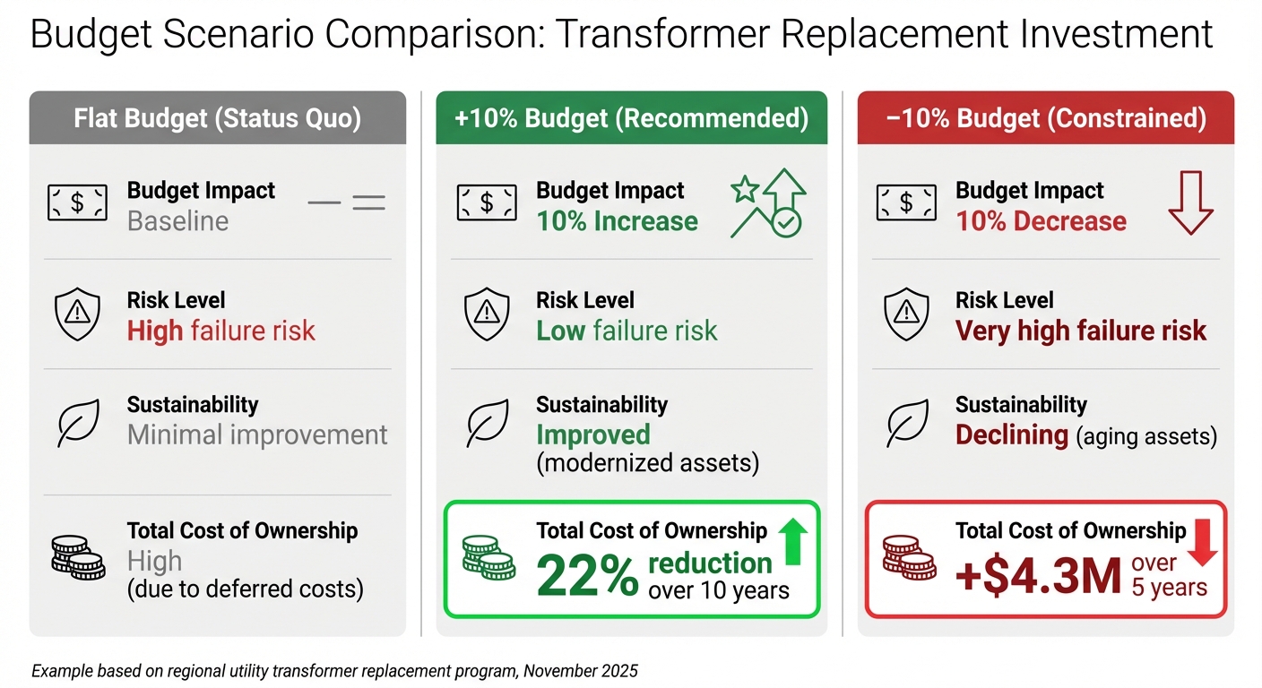
Asset Investment Budget Scenarios: Cost and Risk Comparison
Board members expect a presentation that ties asset data directly to business outcomes in a clear, logical way. A well-structured presentation typically has three parts: a concise one-page executive summary outlining the key decision, a detailed explanation of the context and methodology, and a side-by-side comparison of scenarios to highlight trade-offs. Start with the big picture, walk through how you arrived at your recommendations, and then lay out the choices the board needs to evaluate. Each section has a specific role in building a narrative that moves seamlessly from identifying the core issue to weighing strategic and financial options.
Creating a One-Page Executive Summary
Your executive summary should answer three key questions in under 180 words: Why does this matter? (the problem), What are you proposing? (the solution), and What will it deliver? (the measurable benefits) [2]. The Situation-Complication-Solution framework is a great way to structure this summary [9].
Here’s an example: In November 2025, a regional utility outlined a plan for replacing aging distribution transformers. The situation: 47 transformers had reached a critical age with a high risk of failure. The complication: a flat budget meant many high-risk units would remain unreplaced, increasing the total cost of ownership over five years. The solution: a targeted 10% budget increase to refurbish key units [1].
Give your proposal a memorable two- to three-word name that highlights its primary value, like "Targeted Refurbishment Plan" or "Risk-Reduction Strategy." This makes it easier for board members to reference your plan without needing the slide in front of them. Instead of vague terms like "improved" or "optimized", use directional indicators – arrows or ranges – to show how demand, costs, or capacity will shift under your plan [2].
Presenting the Plan Details and Context
Once you’ve provided the big-picture overview, dive into the analysis that supports your recommendations.
Start by quantifying risk. Define it as the product of an asset’s Likelihood of Failure (based on factors like age, condition, and environment) and the Consequence of Failure (measured in terms of safety, reliability, and financial impact) [1]. This approach turns abstract risks into measurable costs, which can be minimized alongside acquisition and maintenance expenses.
For example, in 2025, a global chemicals company analyzed 300 capital projects and linked asset data to business outcomes. By comparing net present value with factors like plant reliability and supply chain resilience, they discovered that over half of margin-related projects also enhanced operational stability. This insight led the board to prioritize investments that delivered both financial gains and strategic growth [3].
Include contingency plans to show your proposal is adaptable. For instance, you might specify: "If transformer failure rates exceed a set threshold for two consecutive reporting periods, accelerate the replacement schedule." This demonstrates that your plan can adjust to changing conditions [1][2].
Comparing Different Scenarios Side by Side
After laying out the context and analysis, present the board with a clear comparison of the potential paths forward.
Typically, you’ll outline three scenarios: a "do nothing" baseline, your recommended plan, and an alternative option (like a budget-constrained version or an accelerated timeline) [9]. This side-by-side approach highlights the trade-offs and helps the board grasp the consequences of each choice.
Here’s an example comparison for transformer replacements:
| Scenario | Budget Impact | Total Cost of Ownership | Risk Level | Sustainability |
|---|---|---|---|---|
| Flat Budget (Status Quo) | Baseline | High (due to deferred costs) | High failure risk | Minimal improvement |
| +10% Budget (Recommended) | 10% Increase | 22% reduction over 10 years | Low failure risk | Improved (modernized assets) |
| –10% Budget (Constrained) | 10% Decrease | +$4.3M over 5 years | Very high failure risk | Declining (aging assets) |
In this case, the board approved the 10% budget increase because the table made it clear that short-term savings under a flat or reduced budget would lead to significantly higher long-term costs and risks [1].
Chris Griggs from McKinsey & Company points out:
Net present value is the bedrock of ROI estimates, but adding other factors to the analyses can help business leaders see how projects can advance corporate priorities beyond financial returns [3].
When comparing diverse projects, such as cybersecurity upgrades and decarbonization initiatives, normalize metrics into a single score that reflects their importance to organizational goals [3]. This makes it easier for the board to see how a high-return project might conflict with sustainability goals or how a modest investment in resilience could prevent costly future issues.
sbb-itb-5be7949
Using Visuals to Communicate Complex Data
Visuals play a critical role in transforming raw data into insights that are easy to grasp, especially during board discussions. Research shows that visuals are processed much faster than text [4]. For instance, when presenting a $15 million asset investment plan filled with hundreds of data points, the right chart can make your key message clear and actionable. Instead of overwhelming your audience with every detail, focus on simplifying the story. Studies reveal that using visuals can shorten meetings by 24% and speed up decision-making by 21% [10]. This makes it essential to choose the most effective visual tools for your presentation.
Charts, Heat Maps, and Dashboards
Different visuals are suited for different purposes in asset investment presentations. Here are a few examples:
- Waterfall charts: Perfect for illustrating how various cost factors add up to your total budget.
- Heat maps: Use these to highlight areas of high risk. For example, a heat map showing transformer failure risks across 200 substations can help the board quickly identify the five locations most in need of attention.
- Treemaps: These are great for showing budget allocations. If you’re dividing $8.3 million among HVAC systems, electrical upgrades, and structural repairs, a treemap provides a clear visual of each category’s share.
- Performance dashboards: These combine multiple metrics, such as asset condition scores, failure projections, and sustainability progress, into a single, easy-to-navigate view. This eliminates the need to flip through numerous slides and keeps the board focused on the big picture.
The key to effective visuals lies in the 5 C’s: Clarity, Clutter reduction, Context, Consistency, and Contrast [11]. As CFI advises:
If a design element doesn’t reinforce your message, remove it [11].
Adding brief annotations, like marking the end date of a maintenance contract, can transform a simple chart into a powerful storytelling tool.
Formatting for US Audiences
When presenting to US-based boards, it’s important to follow specific formatting conventions. Use the dollar sign with two decimals (e.g., $1,250,000.00 or $1.25 million), write dates in the month-day-year format (e.g., January 4, 2025, or 01/04/2025), and use commas to separate thousands [12]. Percentages should be written with the symbol directly next to the number (e.g., 15%, not 15 percent) [12].
For clarity, round large numbers (e.g., instead of "$1,256,256,256", use "$1.26 billion") [12]. When presenting time-based data, stick to the 12-hour format with "am" or "pm" (e.g., 2:30pm, not 14:30). Consistent formatting not only prevents confusion but also strengthens your credibility. Ink Narrates puts it best:
People trust clarity more than complexity. When you explain an idea simply, it shows you understand it deeply [4].
Showing ROI, Risk Reduction, and Sustainability Results
Boards expect clear evidence that investments deliver financial returns, reduce risks, and align with sustainability goals. The best presentations don’t just outline costs – they explain how the investment pays for itself while advancing broader organizational objectives.
Calculating ROI and Risk Reduction
Start with Net Present Value (NPV) as your baseline. According to McKinsey, adding additional factors helps boards see how projects contribute beyond financial returns [3]. Use the "Value Sandwich" method: place the cost between total savings and the resulting ROI [14]. For example, in a $15 million asset renewal program, show $45 million in avoided failures and a 3.0 ROI over ten years.
Strengthen your case by identifying at least three value drivers, such as reducing costs per unit, cutting engineering time, or lowering field failure rates [14]. This multi-faceted approach ensures that even if one driver is questioned, the others still justify the investment. Tools like Oxand Simeo™ can provide precise data from predictive models to quantify these drivers.
Treat risk as a real cost. For instance, if aging transformers could lead to $8.5 million in emergency repairs and service outages, include that figure in your Total Cost of Ownership (TCO) calculation [1]. Revisit the "do nothing" baseline to provide context.
Clearly distinguish between hard ROI (direct savings like reduced maintenance labor) and soft ROI (avoided costs such as preventing a recall or compliance issue) [14]. Label these categories to help the board differentiate between guaranteed returns and assumption-based projections.
Finally, connect these financial metrics to sustainability goals to craft a well-rounded investment narrative.
Presenting Decarbonization Plans
Once you’ve established financial metrics, apply the same level of detail to sustainability objectives. Decarbonization efforts should be quantifiable and tied to strategic goals. For example, instead of saying "20% emissions reduction", explain it in business terms: "This plan accelerates our net-zero commitment and reduces energy costs by $2.3 million annually" [13]. Use clear metrics like $/tCO2e (dollars per metric ton of CO₂ abated) to show cost-effectiveness [3].
"Net present value is the bedrock of ROI estimates, but adding other factors to the analyses can help business leaders see how projects can advance corporate priorities beyond financial returns."
– McKinsey [3]
Integrate your carbon reduction roadmap into the broader investment strategy. Show how initiatives like upgrading HVAC systems or replacing outdated equipment can simultaneously reduce risk, lower operating costs, and cut carbon emissions. Oxand Simeo™’s sustainability modules can model these interconnected benefits across your portfolio, offering data that aligns with organizational goals. Always present actual performance alongside target KPIs to demonstrate measurable progress [8].
Delivering a Clear and Audit-Ready Presentation
When it comes to creating a board presentation, preparation trumps perfection every time. Start working on your deck at least four weeks in advance to allow for revisions and refinements [7]. Sarah Hinkfuss, Partner at Bain Capital Ventures, puts it best:
What makes a great board meeting isn’t perfect company performance, but rather great preparation [7].
This timeline lets you collaborate with team leaders, anticipate tough questions, and ensure every slide contributes meaningfully to your story.
Be transparent – it earns trust faster than a polished facade. Don’t bury challenges in an appendix or gloss over them. Boards value honesty and want to help tackle problems, not uncover them later. Hinkfuss cautions:
The biggest red flag is anything hidden, missing, or omitted. It’s much better to be direct and upfront about what’s not working… eventually, hidden issues may erode the board’s trust [7].
To ensure your presentation is audit-ready, focus on traceability. Provide an evidence pack that includes sources, assumptions, and reproducibility notes [2]. Use the "rebuild test": ask a colleague to recreate your figures using only your documentation and artifacts [2]. This ensures your data and logic are solid, not just a one-off spreadsheet.
Once your data is sound, shift attention to how you present it. Delivery is as important as content. Use strategic pauses after key points to give the board time to process complex information [4]. Avoid jargon, opting instead for simple explanations that reflect your deep understanding. As Ink Narrates explains:
People trust clarity more than complexity. When you explain an idea simply, it shows you understand it deeply [4].
Focus on connecting the dots between metrics rather than relying on rote memorization.
Lastly, hold your presentation to high standards of formatting and accuracy. Double-check for typos, ensure consistent branding, and include proper footnotes [7]. These details might seem small, but they reinforce the board’s confidence in your recommendations. By combining clear data, thoughtful delivery, and polished details, you can bridge the gap between technical insights and strategic decision-making.
FAQs
How can I make my asset investment presentation resonate with individual board members?
To make your presentation impactful, align your content with the key priorities of each board member. Tailor your narrative to resonate with their focus areas. For example, finance-oriented members will care about ROI and cash flow, operations leaders will prioritize risk reduction and reliability, and those focused on ESG will be interested in sustainability metrics or carbon alignment. Begin with an overview slide that summarizes these priorities to set the tone.
Use visuals that are clear and to the point. Concise bar charts or risk maps work well to showcase metrics, and pair them with short captions that connect outcomes to specific concerns. For instance, a chart showing how a 10% budget increase cuts total cost of ownership by 22% can address both risk mitigation for operations leaders and cost savings for finance-focused members. For ESG advocates, include carbon impact metrics or green value KPIs alongside financial data to illustrate alignment with sustainability goals.
Wrap up each section with a summary tailored to the audience. Emphasize ROI for finance, risk reduction for operations, and carbon savings for ESG. Ensure all content is formatted in U.S. style, such as using USD ($), MM/DD/YYYY dates, and commas for thousands. This personalized approach keeps the board engaged while demonstrating how your plan aligns with their individual priorities.
How can I use visuals to make complex investment data clear and engaging for board presentations?
To make complex data more digestible for board presentations, combine a clear narrative with purposeful visuals. Begin by presenting the key business question, follow it with a straightforward, well-labeled chart or graphic that directly addresses the question, and wrap up with a concise takeaway. Stick to bar or line charts that highlight only the most relevant data, and remove unnecessary details like gridlines or extra legends to keep the focus sharp. Use bold headings, color-coded metrics, and ample whitespace to draw attention to the most critical points.
When dealing with multi-dimensional data – like risk or sustainability metrics – ditch raw tables in favor of visuals such as heat maps, risk maps, or summary graphics. These tools, featuring icons, gradients, and short captions, make it easier to understand complex relationships and zero in on actionable insights. Pair each visual with a brief explanation, such as: "A $2 million investment in predictive maintenance could boost ROI by 12% and cut carbon intensity by 8%."
Consistency is key to a professional presentation. Use the same color palette, font, and chart style throughout. Clearly label every axis and unit (e.g., "USD millions", "% change") to ensure clarity and maintain credibility. A cohesive design allows the board to quickly absorb information and make comparisons without confusion.
How can I show that our asset investment plan supports sustainability goals in a board presentation?
To show how your asset investment plan ties into sustainability goals, start by linking each proposed investment to specific sustainability KPIs. Focus on metrics like tons of CO₂e reduced, percentage of assets powered by renewable energy, or lifecycle cost savings that help mitigate carbon risks. A simple matrix can effectively illustrate these connections, mapping every dollar spent to measurable outcomes. Adding a short, relatable example – such as "Replacing 12 aging transformers with solar-powered units reduces annual emissions by 4,200 tons of CO₂e and creates 15 local jobs" – can make your data more engaging and easier to grasp.
Use clear visuals, like scenario comparisons, to highlight the financial and risk implications of meeting (or missing) sustainability targets. For instance, you could illustrate how reallocating 10% of the budget toward high-risk, high-emission assets might reduce total ownership costs by 22%, while inaction could drive climate-related costs up by $4.3 million over five years. A risk map overlay can further clarify trade-offs between sustainability, compliance, and financial outcomes, making your case stronger.
Lastly, align your presentation with the IFRS Sustainability Disclosure Standards (IFRS S1/S2) by demonstrating how your plan addresses material sustainability risks and opportunities. Include audited carbon calculations, Paris Agreement-aligned targets, and governance processes to track progress. This ensures your proposal is not only persuasive but also ready for audits and regulatory compliance.
Related Blog Posts
- Infrastructure Asset Management: A Risk-Based Approach for Multi-Year CAPEX Planning
- Strategic CAPEX Planning for Highway Concessions: Balancing Grantor Compliance and Profitability at End-of-Term
- Asset Investment Planning 101: How to Decide What to Invest in, When and How Much
- Carbon-Aligned Investment Planning: How to Prioritise Projects by CO₂ Reduced per Euro