


If a board can’t see risk, cost, timing, and return in one view, funding usually stalls.
I’d boil this article down to one point: a board-ready asset report must turn raw asset data into a funding decision. That means showing which assets are at risk, what delay will cost, how much funding is needed, when work should happen, and what the organization gets back. Reports that do this can move capital requests 70%–80% faster than vague requests.
Here’s the short version of what executives need to see before they approve funding:
- Portfolio snapshot: asset base, replacement value, FCI, and Remaining Useful Life
- Risk view: failure likelihood, failure impact, compliance gaps, and deferred maintenance liability
- Funding choices: defer, replace like-for-like, or upgrade
- Money view: CAPEX, OPEX, 10-year TCO, cost of delay, and contingency
- Energy and carbon view: kWh, therms, CO2e, NPV, IRR, and payback where energy is part of the project
- Scenario view: constrained, balanced, and accelerated funding paths
- Evidence trail: source data, risk method, and cost model tied back to the asset register
A few numbers matter right away. An FCI above 0.30 points to deep deterioration, deferred work can grow by 1.3x–1.5x per year, and emergency repairs can cost about 4.8x more than planned work. Also, when repair spend hits 75% of replacement value, I’d flag that asset for near-term review.
Quick comparison
| What the board needs | What to show |
|---|---|
| Current exposure | FCI, top risk assets, compliance status |
| Cost of delay | Deferred backlog growth, emergency repair premium, cascade damage |
| Funding ask | Project cost in USD, plus 10%–15% contingency for projects above $50,000 |
| Timing | Year or quarter, plus 5- to 10-year capital peaks |
| Return | Risk reduction, TCO change, uptime, energy savings, CO2e reduction, payback |
So if I were building this report, I’d keep the main pack short: one dashboard, one approval table, and an appendix for proof.
sbb-itb-5be7949
The minimum content a board-ready asset report must include
A board-ready report should help people make a decision. It should NOT read like a giant spreadsheet pasted into a slide deck. Put only the metrics that drive action in the main report, and push the rest into the appendix.
The clearest flow is simple: portfolio exposure, then risk, then investment options.
Portfolio overview, condition scores, and criticality
Start with a plain-English snapshot of the asset base. Show the number of sites or facilities, major asset classes, total replacement value, and the portfolio’s Facility Condition Index (FCI). Define FCI as deferred maintenance ÷ current replacement value. As a rule of thumb, scores below 0.10 are generally good, while scores above 0.30 point to critical deterioration [1].
Next, show Remaining Useful Life (RUL) across a 5- to 10-year horizon, using this formula: (Design Life × Condition Factor) – Age [3]. This helps answer the question the board cares about most: How long can this portfolio keep operating safely?
Include area in square feet, with square meters in parentheses when needed. Then flag the 10 highest-risk assets by condition score so leaders can see where funding should go first [1].
Risk exposure, failure consequences, and compliance status
Once the snapshot is in place, turn condition data into risk the board can act on. A condition score by itself doesn’t say much. The board needs to see the likelihood and consequence of failure for critical assets, especially in terms of safety, service disruption, financial loss, and regulatory exposure.
Use a single red/amber/green view for regulated systems such as:
- fire suppression
- HVAC
- electrical distribution
- elevators
That way, exposure is clear at a glance [1]. For every red item, add the exact consequence. Don’t just show that something is in bad shape. Show what happens if it fails, and why the work can’t wait.
You should also quantify deferred maintenance liability, meaning the dollar amount of identified, unfunded work. This is where the economics get hard to ignore. Deferred costs usually compound at 1.3x to 1.5x for each year they stay untouched, and emergency repairs cost about 4.8x more than planned work [1][3]. Those numbers make the case for near-term action fast.
Investment options, lifecycle cost, carbon impact, and ROI
After the risk section, show what each funding path does to cost, carbon, and timing. Risk should lead straight to a funding choice.
For each capital request, compare three options side by side: defer or keep repairing, replace with an equivalent asset, or replace with an upgraded option that improves performance or supports decarbonization [4][3]. Three options are usually enough to make the trade-offs clear without muddying the picture.
Each option should include:
- upfront CAPEX
- projected annual OPEX
- 10-year TCO
- cost of delay, including inflation escalators, cascade damage, and emergency premiums [3]
For energy-related projects, also include kWh savings, therm savings where relevant, metric tons of CO2e reduction, NPV, IRR, and payback period [4][1][6].
Finally, flag any asset whose cumulative repair cost has reached 75% of replacement value for Year 1 review. Past that point, continued repair is rarely cost-effective [7].
How to structure the board pack: dashboards, tables, and appendices
Use a simple three-tier board pack: a one-page dashboard, a project approval table, and technical appendices with the backup. Put them in that order so the board sees the portfolio first, then the decisions, then the proof behind those decisions. It keeps the flow clean: summary first, approval next, audit trail after that, without dragging executives into the weeds.
Executive dashboard layout: condition, risk, funding gap, and carbon
Start with a one-page view that answers four basic questions: is the portfolio safe, funded, compliant, and on track for carbon targets?
| Dashboard Component | Key Metrics to Show |
|---|---|
| Condition Profile | FCI by building; % of critical assets [1][8] |
| Risk Exposure | Count of high-risk assets; top 10 by failure probability and consequence [1] |
| Financials | 5- to 10-year CAPEX peaks; funding gap; deferred maintenance liability; spend vs. budget variance [1][3] |
| Compliance | % of regulated systems with current certificates (fire, HVAC, elevators); outstanding regulatory findings [2][1] |
| Sustainability | Energy Use Intensity (EUI) trends; decarbonization trajectory showing GHG and kWh reductions [1] |
Use red/amber/green thresholds across the page so leaders can spot exception flags fast [1]. If something needs attention, it should jump off the page in seconds.
Investment summary table for project approval
The dashboard shows the problem. The table shows the response. This is where each project should be presented in a way that makes approval, deferral, or challenge easy.
| Asset / Site | Condition Score | Risk Rank | Recommended Action | Compliance Impact | Requested Funding (USD) | Planned Date | Expected Risk Reduction | 10-Year TCO Effect | Carbon Impact | ROI / Payback |
|---|---|---|---|---|---|---|---|---|---|---|
| HVAC System – Site A | 2/5 | High | Full Replacement | Mandatory | $1,250,000 | Q3 2026 | 85% failure reduction | −25% OpEx | −15% GHG | 4.2 years |
| Roof Section B | 1/5 | Critical | Restoration | No direct impact | $850,000 | Q4 2026 | 100% leak elimination | Avoids 1.5x damage | No direct impact | 5.5 years |
| Electrical Switchgear | 3/5 | Medium | Modernization | Mandatory | $450,000 | Q1 2027 | 60% uptime increase | Extends life 15 years | No direct impact | 8.0 years |
| LED Retrofit – Portfolio | 4/5 | Low | Upgrade | No direct impact | $2,100,000 | Q2 2026 | No direct impact | −40% energy cost | −30% EUI; 1,250,000 kWh saved | 2.8 years |
Each row needs at least one hard number. Don’t lean on narrative alone. If a project cuts failure risk by 85%, saves 1,250,000 kWh, or avoids 1.5x downstream damage, say that plainly.
For projects above $50,000, add a separate contingency line of 10% to 15%. That makes the funding ask easier to follow and avoids the old problem where hidden buffers get buried inside the total.
What to move to the appendix
The appendix is for evidence behind the recommendation, not for the decision itself. Think of it as the place where someone can check the math, trace the logic, or review the field record without cluttering the main pack.
Move items like these to the appendix:
- Detailed inspection photos and technician field notes
- Deterioration curves and model assumptions used for Remaining Useful Life calculations
- Maintenance logs, contractor quotes and bid comparisons from at least two bids, and calculation worksheets for energy savings, structural integrity, or NPV/IRR [2][4][5]
"The board approves the headline programme but can’t see how it was built. Simeo’s audit trail links every recommended investment back to the asset, the condition data, the model, and the action." – Simeo by Oxand [5]
How to present funding scenarios and make trade-offs clear
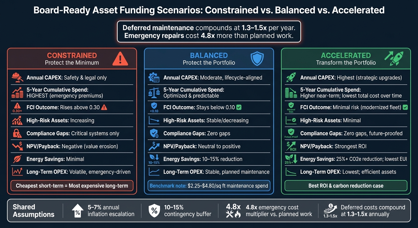
Board-Ready Asset Reporting: 3 Funding Scenarios Compared
Turn the project list into three portfolio scenarios so the board can compare the cost of delaying, balancing, or speeding up funding. The goal is simple: show how risk, spend, and carbon move together.
When funding falls short, the cost doesn’t disappear. It shifts into risk, emergency work, and future CAPEX. And those deferred costs don’t sit still. They compound at 1.3–1.5x annually, while emergency repairs come with a 4.8x cost premium compared with planned work [3].
3 board-level scenarios: constrained, balanced, and accelerated
Constrained (protect the minimum) covers safety and regulatory compliance only. It has the lowest upfront spend, but it also carries the most long-term risk. Deferred maintenance piles up, FCI rises above 0.30, and the portfolio slips into a reactive repair cycle [1].
Balanced (protect the portfolio) follows a lifecycle-aligned replacement schedule. It keeps FCI below 0.10 and maintenance spend within benchmark ranges of about $2.25–$4.80 per square foot [1]. It also smooths capital peaks through planned reserve funding and keeps the emergency-to-planned repair ratio below 20% [1][3].
Accelerated (transform the portfolio) puts more money in earlier to fix obsolete systems and close performance gaps. This is where energy-efficiency upgrades, regulatory changes, and carbon-reduction targets fit. Upfront cost is higher, but it offers the strongest ROI case and the biggest opening for carbon reduction [3][5].
One comparison table that shows all trade-offs
Use one comparison table to force a single board choice.
| Metric | Constrained | Balanced | Accelerated |
|---|---|---|---|
| Annual CAPEX | Minimum (safety/legal only) | Moderate, lifecycle-aligned | Highest (strategic upgrades) |
| 5-Year Cumulative Spend | Highest (emergency premiums) | Optimized, predictable | Higher near-term spend; lower total cost over time |
| High-Risk Assets Remaining | Increasing (FCI > 0.30) [1] | Stable/decreasing (FCI < 0.10) [1] | Minimal (modernized fleet) |
| Compliance Gaps | Critical systems only; gaps remain | Zero gaps; proactive monitoring | Zero gaps; future-proofed |
| NPV / Payback | Negative (value erosion) | Neutral to positive | Strongest (energy/OpEx savings) [3] |
| Energy Savings / CO2e Reduced | Minimal; efficiency keeps eroding | Moderate (10–15% reduction) [1][5] | High (25%+ reduction; low EUI) [1][5] |
| Long-Term OPEX | Volatile; emergency-driven | Stable; planned maintenance | Lowest; efficient assets |
The table makes the trade-off hard to miss: the cheapest short-term option can become the most expensive long-term choice. If the board sees that the constrained path drives the highest five-year cumulative spend while leaving the most high-risk assets unresolved, the discussion usually changes. It stops being, "How do we cut the budget?" and becomes, "Which scenario fits our risk tolerance?"
List the assumptions right below the table so the board can pressure-test the figures:
- 5%–7% annual inflation escalation
- 10%–15% contingency buffer
- 4.8x emergency cost multiplier [3]
Build audit-ready reporting on ISO 55001 and Oxand data foundations
Link the report to ISO 55001 governance and evidence
Once the scenario comparison is done, the board still needs something else: an audit trail. A board paper has to hold up under CFO and audit review. That only happens when each funding recommendation can be traced to a documented source.
ISO 55001 makes that link non-negotiable. The report needs to connect the asset register to risk criteria, asset management objectives, and the Strategic Asset Management Plan (SAMP) [6]. Put simply, every CAPEX line item should answer three plain questions a CFO or auditor will ask:
- What condition data supports this?
- What risk comes from doing nothing?
- What model produced the cost estimate?
When that chain is clear, the funding request stops sounding like a judgment call. It becomes a decision backed by evidence.
How Oxand Simeo™ and Simeo Inventory support board-ready reporting

Audit-ready reporting begins with a clean asset register. Simeo Inventory gives teams a structured register that records installation dates, manufacturer design life, condition scores on a 1–5 scale, and service history [3][9]. With Simeo GO, field teams can update that data in real time, which standardizes inspection inputs and cuts out manual spreadsheet mistakes [6][9]. That data then flows straight into the dashboard, risk ranking, and funding scenarios.
From there, Oxand Simeo™ turns raw asset data into the multi-year investment view that executives need. The platform uses more than 10,000 proprietary aging models and 30,000 maintenance actions to simulate degradation, cost, risk, energy, and carbon effects across funding scenarios. The outputs are not abstract. In one public sector portfolio, the approach cut the maintenance backlog by 27% and delivered €4 million in energy savings across 66 buildings in the first budget cycle [6][9]. Forecasting based on condition data can also bring CAPEX budget variance below 15%, compared with 40%–65% for teams that rely on age-based estimates [1][3].
Conclusion: the checklist executives need before approving funding
Before funding gets approved, the report should clearly spell out:
- the funding ask
- condition
- risk
- compliance impact
- lifecycle cost
- timing
- carbon impact
- ROI
- payback
- scenario comparison
- evidence trail
That’s the difference between a technical report and one the board can act on: trusted asset data, traceable governance, and scenario modeling that lays out the trade-offs before the money is committed.
FAQs
How often should a board-ready asset report be updated?
It depends on the reporting scope, but monthly is the standard rhythm for most facilities. That pace gives teams enough time to spot trends, see where risks are starting to show up, and act before small issues turn into bigger ones.
For board-level governance or trustee reporting, quarterly is more common. It gives leaders a clear view of performance without pulling them into too much day-to-day detail.
Long-term capital plans should be fully reset every 3 to 5 years. In between those formal reporting cycles, real-time dashboards let leadership keep an eye on performance without leaning on stale data or manual updates.
What data quality is needed to trust the funding request?
Executive trust comes from a case leaders can check, question, and stand behind. That usually rests on four basics:
- a standardized, centralized asset register
- current maintenance and inspection records
- clear links between asset condition, risk, cost, and outcomes
- transparent uncertainty and repair-versus-replace trade-offs
Put simply, the request needs to be grounded in data, not guesswork. When those pieces are in place, the case is more consistent, up to date, and much easier to compare across sites.
How do I tailor this report for maintenance vs. decarbonization projects?
Adjust KPIs so they line up with the investment goal.
For maintenance, put the spotlight on FCI, deferred maintenance liability, and the share of emergency repairs versus planned maintenance. Those numbers help show a simple point: spending now can cut reactive repair costs later and help assets last longer.
For decarbonization, track Scope 1 and 2 emissions, EUI benchmarks, carbon-adjusted lifecycle costs, carbon reduction potential, and compliance impact. This makes it easier to see not just what a project costs, but what it changes.
For both, use the same 1-5 condition scale and NPV to compare scenarios. That way, you’re not mixing apples and oranges when you evaluate options.