Predictive Maintenance Dashboards: Which Views Actually Drive Better Decisions?
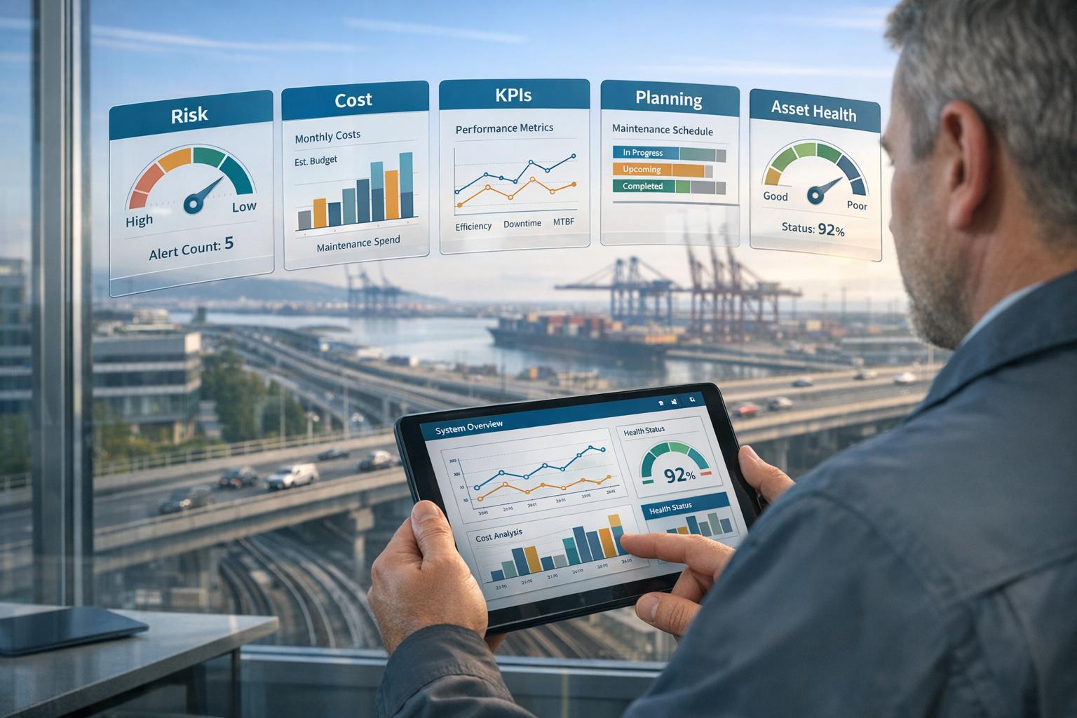
Predictive maintenance dashboards can transform overwhelming data into actionable insights. But which views are the most effective? This article breaks down five dashboard types that help maintenance teams make better decisions, reduce downtime, and optimize costs:
- Asset Health Overview: Offers a portfolio-wide view of asset performance, predicting failures and integrating sustainability metrics.
- Risk and Criticality: Prioritizes high-risk assets, linking risks to financial and operational impacts.
- Work Management and Backlog: Tracks open tasks, technician efficiency, and backlog trends to improve productivity.
- Real-Time Condition and Alerts: Monitors live IoT data for instant issue detection and rapid response.
- Performance and Reliability KPI: Focuses on long-term trends like MTBF and maintenance costs to guide future investments.
Each dashboard serves a unique purpose, from daily operations to multi-year planning. The key is aligning the right dashboard with the decision-making needs of your team. Keep dashboards focused – 6–8 key metrics per view – and combine leading (predictive) and lagging (historical) indicators for smarter strategies.
Maintenance KPIs In Power BI: Work Management Process Dashboard
sbb-itb-5be7949
1. Asset Health Overview Dashboard
The Asset Health Overview Dashboard gives maintenance leaders and executives a centralized view of their entire asset portfolio’s performance. By focusing on 6–8 key metrics, it avoids overwhelming users while ensuring every data point is actionable [4]. These concise insights are the foundation for deeper risk assessments.
Risk Visibility
This dashboard uses predictive models to anticipate asset degradation and pinpoint vulnerabilities before failures occur. Tools like Oxand Simeo™ rely on a database of over 10,000 proprietary aging and performance models to simulate deterioration across portfolios, even in the absence of dense IoT sensor networks [2]. For each asset, the dashboard addresses a critical question: How much risk is building up, and when does it become urgent?
ROI and Cost Optimization
Predicting when an asset might fail allows teams to plan maintenance and renewals at the right time. This proactive strategy helps stabilize both CAPEX and OPEX, while reducing overall ownership costs. As the Head of Budget and Asset Valuation Department at In’li noted:
“We turned to Oxand because we needed a tool that would provide us with a predictive – not just corrective – view and help us manage our investments more effectively.” [2]
Organizations using structured maintenance dashboards often experience up to a 30% drop in unplanned downtime [4], with many predictive maintenance tools delivering measurable ROI within 6–12 months [2].
Sustainability Metrics Integration
These dashboards also incorporate sustainability metrics, such as energy performance goals and decarbonization constraints. Managers can quickly identify which assets fall short of energy targets. By combining sustainability data with asset health metrics, teams can make investment decisions that balance budget considerations, operational risks, and carbon reduction objectives – all within the same platform.
Suitability for Multi-Year Planning
The Asset Health Overview Dashboard is especially useful for long-term planning. Predictive insights feed directly into multi-year Master Plans, shifting the focus from reactive emergency repairs to a steady, forward-thinking investment path. This approach transforms raw asset data into a format that resonates with boards, budget committees, and elected officials [2]. Up next, we’ll explore dashboards that focus on risk prioritization.
2. Risk and Criticality Dashboard
While the Asset Health Overview provides a broad snapshot of your portfolio, the Risk and Criticality Dashboard zeroes in on the assets that need immediate attention. It prioritizes assets based on their potential financial and operational impact, helping teams decide where to focus first. This detailed approach connects risk insights with cost considerations and sustainability efforts.
Risk Visibility
This dashboard offers clear metrics like “High-Risk Asset Count”, “Newly Degraded Count,” and “Asset Criticality Coverage” to help teams assess exposure in real time [7]. For example, achieving 100% Asset Criticality Coverage for Tier 1 assets ensures that all critical equipment has a documented maintenance plan and identified failure modes [5]. When coverage drops, the dashboard flags it, prompting action.
Visual tools like a Risk Heatmap or Matrix make decision-making faster. By plotting asset criticality against current health, these tools highlight urgent risks – essentially the “ticking time bombs” that could require immediate capital investment [6][7].
“Unknown critical assets are your biggest risk. You can’t manage what you haven’t identified and planned for.” – shreen, Oxmaint [5]
ROI and Cost Optimization
The financial benefits of this dashboard are clear: planned maintenance is 3–5 times cheaper than reactive repairs [5]. By identifying high-risk assets on the verge of failure, it allows teams to allocate resources efficiently and avoid costly surprises.
One standout feature is the Ranked Bar Chart, which overlays downtime hours with actual cost impact [4]. This visualization translates technical risks into financial terms, making it easier to justify preventive investments to budget committees. Tim Cheung, CTO and Co-Founder of Factory AI, highlights this advantage:
“By quantifying downtime in dollar terms in your dashboard, you instantly validate the ROI of preventive maintenance software.” [6]
Sustainability Metrics Integration
This dashboard also ties risk management to broader operational goals. Metrics like Regulatory Compliance Status and Safety Incidents are tracked to support sustainable and compliant operations [5]. By comparing an asset’s Effective Age to its Actual Age, teams can pinpoint where targeted interventions could extend lifecycles and reduce waste [7].
Suitability for Multi-Year Planning
The dashboard bridges short-term risk insights with long-term strategies, making it an essential tool for CAPEX planning. Features like the Capital Replacement Forecast and MTBF (Mean Time Between Failures) trends help teams make informed decisions about future investments [4][5]. For instance, a declining MTBF on a critical asset signals that a replacement may be more cost-effective than continued repairs.
The Matrix View is particularly useful for spotting clusters of high-criticality assets nearing the end of their life at the same time – patterns that are hard to detect in standard tables [7]. Tools like Oxand Simeo™ enhance this planning by running simulations under budget, risk, and decarbonization constraints, enabling teams to create stable CAPEX plans instead of reacting to emergencies year after year [2].
3. Work Management and Backlog Dashboard
The Risk and Criticality Dashboard highlights potential risks, but the Work Management and Backlog Dashboard focuses on ongoing tasks and team capacity. It provides insights into open work orders, scheduling progress, and technician efficiency, offering maintenance managers a clear view of how well operations are running.
Risk Visibility
An aging backlog is often a red flag for future equipment issues. By categorizing work orders into time buckets (1–7 days, 8–30 days, and 30+ days), you can determine whether delays are isolated or part of a larger trend [4]. Here’s a practical rule: if total backlog hours exceed 2–4 weeks of crew capacity, operational risks are likely building up [9].
Another key metric is the Reactive vs. Planned Work Ratio. High-performing teams aim for 80% planned work, less than 20% reactive tasks, and fewer than 10% emergency orders [9]. When the dashboard shows this ratio tipping in the wrong direction, it signals that the team might be stuck in a reactive cycle instead of preventing failures.
“The most impactful change any maintenance leader can make is to put MTBF, MTTR, and PM compliance on a screen that the whole team sees every morning. When technicians know the scoreboard, behavior shifts. Backlog starts shrinking.” – Rajiv Menon, CMRP [9]
ROI and Cost Optimization
Labor costs are a huge part of the budget, and this dashboard helps identify inefficiencies. For example, wrench time – the percentage of a technician’s shift spent on actual hands-on work – typically averages just 25–35% across the industry. However, top-performing teams boost this to over 55% [9]. Closing this gap can lead to significant savings: plants using structured maintenance KPI dashboards report an average of 40% labor cost savings [9].
The dashboard also simplifies capital expenditure requests. Proposals for asset replacements that include 12 months of trended maintenance cost data get approved twice as fast as those without supporting evidence [10]. When cost-per-asset data is tracked over time, budget discussions move from subjective opinions to hard facts.
Sustainability Metrics Integration
Deferred maintenance doesn’t just drive up costs – it shortens asset life and generates waste. AI-driven maintenance scheduling, visible through this dashboard, can extend the lifespan of key equipment by up to 30%, enabling components to reach 85–95% of their rated service life before needing replacement [8]. This reduces material waste and delays costly capital investments.
Suitability for Multi-Year Planning
This dashboard isn’t just for day-to-day operations; it’s also a tool for long-term planning. Integrated Remaining Useful Life (RUL) models predict when assets will hit critical thresholds, supporting 5–10 year capital renewal forecasts [8]. Finance teams can defer replacements based on actual asset conditions rather than relying on age-based assumptions. Tools like Oxand Simeo™ take this further by running multi-year investment scenarios under budget, risk, and decarbonization constraints, transforming daily backlog data into actionable, long-term capital strategies [2].
Next, we’ll explore dashboards that provide real-time condition monitoring and alerts to refine decision-making even further.
4. Real-Time Condition and Alert Dashboard
While the Work Management and Backlog Dashboard focuses on scheduled tasks, the Real-Time Condition and Alert Dashboard keeps an eye on live conditions. By collecting real-time IoT data – such as vibration, temperature, and pressure – this dashboard integrates it with maintenance history and asset age to calculate a dynamic health score ranging from 0 to 100. If the score drops, alerts are triggered instantly. This constant monitoring enables quick risk detection and rapid response.
Risk Visibility
Without real-time monitoring, the average response time to equipment issues is 47 minutes, leading to unnecessary costs [13]. Real-time dashboards slash this delay to mere seconds. They also improve detection rates, identifying 85% of equipment issues before failure, compared to just 73% under manual monitoring [13]. These dashboards use a three-tier alert system to ensure the right people are notified promptly:
- Level 1 (Advisory): General notifications for awareness.
- Level 2 (Action/Auto-Work Order): Alerts that generate automated work orders.
- Level 3 (Critical/Emergency Escalation): Immediate escalation for severe issues.
Automating Level 2 alerts bridges the gap between identifying a problem and taking action. This not only enhances safety but also delivers major operational savings.
“The gap between knowing about a problem and acting on it shrinks from hours to seconds.” – Oxmaint Real-Time Guide [13]
ROI and Cost Optimization
Facilities equipped with real-time dashboards report an 82% reduction in unplanned downtime and 30–40% lower maintenance costs [13]. Automating reports can save 50+ hours per month that would otherwise be spent on manual data preparation [12]. Most organizations see a return on investment within 8–12 months of implementation [13]. A practical way to start is by installing sensors on the 20% of assets responsible for 80% of downtime risk [13].
Sustainability Metrics Integration
These dashboards also help identify energy inefficiencies early. For example, a 15–25% increase in energy use by an asset often signals mechanical degradation [13]. Specifically, a 15% rise in motor energy consumption can indicate bearing failure 60–90 days in advance. This gives maintenance teams ample time to plan repairs before a breakdown occurs [13].
Suitability for Multi-Year Planning
Beyond day-to-day alerts, these dashboards provide insights for long-term asset planning. By analyzing health score trends, they can predict when assets will hit critical thresholds, offering data-driven support for 3–5 year capital budget planning [11]. Additionally, tracking mean time between failures (MTBF) highlights equipment nearing the end of its lifecycle, making it easier to justify replacements over repairs [13]. Tools like Oxand Simeo™ can integrate these insights into multi-year investment strategies, balancing live condition data with budget and decarbonization goals.
| Score Band | Health Status | Failure Probability (90-Day) | Recommended Action |
|---|---|---|---|
| 85–100 | Healthy | Under 5% | Maintain current PM schedule |
| 70–84 | Monitor | 5–15% | Increase inspection frequency |
| 50–69 | Alert | 15–35% | Schedule corrective work order within 72 hours |
| 30–49 | High Risk | 35–65% | Immediate action plus capital planning flag |
| Below 30 | Critical | Above 65% | Emergency intervention or shutdown |
Source: [11]
5. Performance and Reliability KPI Dashboard
Once immediate conditions are under control, the next step is evaluating long-term performance. While the Real-Time Condition and Alert Dashboard focuses on live signals, the Performance and Reliability KPI Dashboard takes a broader view, analyzing how effective the maintenance program is over months and years.
Risk Visibility
This dashboard uses a risk heatmap to plot Asset Criticality against Health, making it easy to pinpoint assets at the highest risk. These visual insights help teams identify vulnerabilities and justify capital expenditures to leadership more effectively [6]. Alongside the heatmap, metrics like High-Risk Asset Count and Risk Trends help validate whether interventions are reducing risks over time [7].
ROI and Cost Optimization
One standout feature of this dashboard is its ability to translate technical metrics into financial terms. For instance, it can quantify downtime costs, such as showing how 12 hours of downtime at $4,000 per hour impacts production – numbers that resonate in budget discussions [6]. Another key metric is Maintenance Cost as a Percentage of Replacement Asset Value (RAV). High-performing programs typically keep this figure between 2–3%, while underperforming ones exceed 6% [14]. Additionally, shifting just 10% of maintenance activities from reactive to planned can cut costs by about 18% [14]. Metrics like the Planned vs. Reactive Ratio make this dashboard a practical tool for cost-conscious decision-making.
“The KPI dashboard didn’t just measure our performance – it transformed how we think about maintenance entirely.” – VP of Operations, Heavy Manufacturing Company [14]
Sustainability Metrics Integration
The dashboard also integrates energy performance and decarbonization metrics, allowing teams to align maintenance strategies with sustainability goals [2]. For example, tools like Oxand Simeo™ use a database of over 10,000 proprietary aging and energy performance models to predict how asset degradation impacts energy consumption. This makes it possible to connect maintenance decisions to measurable reductions in CO₂ emissions and kWh usage across an entire portfolio.
“We needed a tool that would provide us with a predictive – not just corrective – view and help us manage our investments more effectively… and integrates an energy performance objective.” – Head of Budget and Asset Valuation Department, In’li [2]
Suitability for Multi-Year Planning
This dashboard goes beyond real-time insights, feeding predictive degradation models into 3–5 year capital requirement forecasts [3] [2]. Metrics like MTBF trends (Mean Time Between Failures) help identify equipment nearing the end of its lifecycle, while OEE trajectories (Overall Equipment Effectiveness) reveal inefficiencies that worsen over time. Organizations using structured KPI dashboards are 3.4 times faster at identifying chronic failure assets compared to those relying on manual tracking [3]. These insights are invaluable for creating defensible, long-term investment plans that align daily operations with strategic asset priorities.
Pros and Cons of Each Dashboard Type
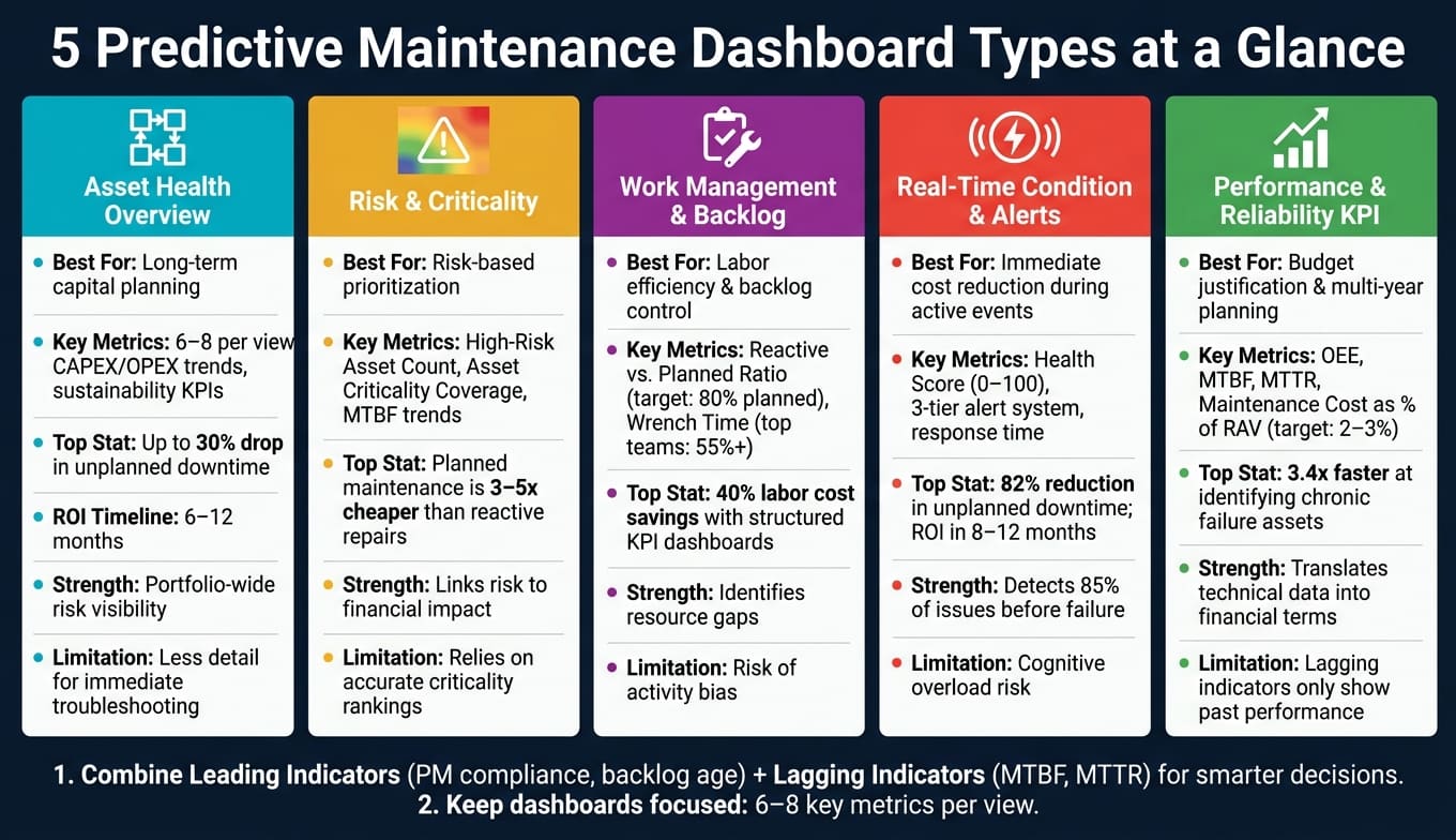
5 Predictive Maintenance Dashboard Types: Strengths, Use Cases & Key Metrics
Building on the detailed breakdown of each dashboard type, here’s an analysis summarizing their strengths and weaknesses within risk-based, ROI-focused maintenance strategies. No single dashboard can meet all needs. Instead, each serves a specific purpose, and understanding their pros and cons helps avoid cluttered, ineffective designs.
“A dashboard with 20+ KPIs hinders quick decision-making.” – Josh Turly, Oxmaint [4]
The table below highlights how different dashboard types perform in key areas like risk management, cost control, and long-term planning:
| Dashboard Type | Strengths | Limitations | Best Supports |
|---|---|---|---|
| Asset Health Overview | Quickly identifies underperforming assets and simplifies complex data. | May lack the detailed insights needed for immediate troubleshooting. | Long-term capital planning and replacement cycles. |
| Risk & Criticality | Focuses on failure indicators and ensures safety and compliance. | Depends heavily on the accuracy of initial criticality rankings. | Risk-based prioritization by production impact. |
| Work Management | Improves technician productivity and highlights resource gaps. | Can become overly focused on work order counts, leading to activity bias. | ROI-driven labor efficiency and backlog control. |
| Real-Time Condition & Alerts | Reduces decision time from hours to minutes, minimizing downtime. | May overwhelm users with cognitive load and requires mobile accessibility. | Immediate cost reduction during active events. |
| Performance & Reliability KPI | Offers a big-picture view using metrics like OEE, MTBF, and MTTR. | Relies on lagging indicators, which only show past performance. | Budget justification and multi-year investment planning. |
This breakdown clarifies how each dashboard supports risk management, cost control, or long-term planning. A key takeaway is that leading indicators (e.g., PM compliance, backlog age) help predict future reliability, while lagging indicators (e.g., MTBF, MTTR) reflect past performance [5]. Both are essential, but they serve different decision-making needs.
To maximize effectiveness, align dashboards with the specific trade-offs they address. For example, a technician benefits most from a mobile-first, real-time alert dashboard, while a VP of Operations needs monthly trends and concise status updates. Limiting views to 6–8 key metrics ensures critical information isn’t overlooked.
“If you cannot state the decision a metric supports, remove it.” – Johnson, Oxmaint [1]
Use these insights to design dashboards that enhance decision-making across all levels of maintenance operations.
Conclusion
There’s no one-size-fits-all dashboard for every situation. The real strength comes from knowing which dashboard to use and when. For example, a Real-Time Condition & Alert dashboard is perfect for speeding up responses during active failures, while a Risk & Criticality dashboard helps prioritize actions to prevent issues before they occur. On the other hand, a Performance & Reliability KPI dashboard gives executives the financial insights they need to greenlight next year’s budget.
Successful maintenance programs often take a layered approach. This might include operational dashboards for day-to-day tasks, reliability dashboards for weekly trend reviews, and financial summaries for monthly or quarterly capital planning. With this setup, everyone – from technicians on the shop floor to the VP of Operations – gets the right data at the right time.
Two key principles bring these dashboards together. First, always combine leading and lagging indicators. For instance, PM compliance can signal future reliability, while metrics like MTBF reveal past performance – both are necessary for smart decision-making. Second, keep dashboards focused and clear. Studies show that asset replacement proposals backed by 12 months of cost-per-asset data are approved 2.1x faster [3]. Similarly, well-structured KPI dashboards help teams identify recurring failure issues 3.4x faster [3].
“The goal is not to have the most complex Excel sheet. The goal is to have the clarity to make the right decision, right now.” – Tim Cheung, CTO and Co-Founder, Factory AI [6]
Shifting from reactive problem-solving to a planned maintenance strategy – where 70–85% of work is scheduled instead of emergency-driven – leads to huge cost savings and longer asset lifespans [3]. Dashboards alone won’t make this transformation happen, but the right mix of views, integrated into real decision-making processes, can speed up the journey significantly.
FAQs
Which dashboard should we start with first?
A practical first step in managing equipment is to assess its health at the asset level. This approach helps prioritize which pieces of equipment in your portfolio need immediate attention by answering a key question: Which assets should be addressed first?
By using a unified asset health index, you can combine critical metrics – such as vibration, temperature, and pressure – into a single, streamlined score. This simplifies complex data and prevents overwhelming amounts of information. With this clear view, you can quickly identify high-risk assets, allowing you to focus your efforts where they will have the most impact on reliability and informed investment decisions.
How do we choose the 6–8 metrics that matter most?
When assessing maintenance performance, it’s crucial to focus on metrics that tie directly to business results. A balanced approach involves using both lagging indicators and leading indicators:
- Lagging indicators track past performance and include metrics like Mean Time Between Failures (MTBF), Mean Time to Repair (MTTR), and Overall Equipment Effectiveness (OEE).
- Leading indicators provide insights into future performance, such as Preventive Maintenance (PM) compliance and condition-based triggers.
Design your dashboard to answer specific, role-related questions and spotlight actionable KPIs. For example, it should highlight trends like a decreasing MTBF or signal when a high reactive maintenance ratio might require budget adjustments. This ensures decision-makers can respond quickly to emerging issues.
How do we connect dashboard metrics to ROI and budget approvals?
To tie dashboard metrics to ROI and secure budget approvals, focus on translating technical health data into financial terms. A risk-based approach works well here. Start by calculating ROI using this formula:
(Total Savings – Total Costs) / Total Costs
Be sure to emphasize both direct savings (like reduced downtime) and indirect benefits (such as delaying capital expenditures).
Metrics like Health Scores (which measure the likelihood of failure) and Criticality Scores (which assess the impact of failure) are essential tools. These scores allow you to build data-backed proposals that align closely with CAPEX and OPEX objectives, making your case more compelling.